
Neutopia
Super-charge Neutopia’s course creation platform.
Project overview
About Neutopia
Neutopia is a community-focused platform designed to enhance social learning and digital engagement. The organisation aims to transform education by making it more accessible and collaborative, serving a range of educators, entrepreneurs, and forward-thinking organizations.
Project description
This project aimed to equip both novice and experienced learning designers with the tools to quickly and easily create high-quality online courses within the Neutopia platform, supported by AI where appropriate.
Project outcomes and results
A validated concept the client can confidently take forward. The AI-assisted workflow reduces complexity while supporting designers of all experience levels, establishing a scalable foundation from course outlining through to content creation.
It maintains user control through low-friction, familiar interactions and provides a strong base for future development and testing.
The client responded positively, noting its clear alignment with both user needs and business goals.
MY ROLE
UX/UI Designer
DONE WITH
Magi Creative
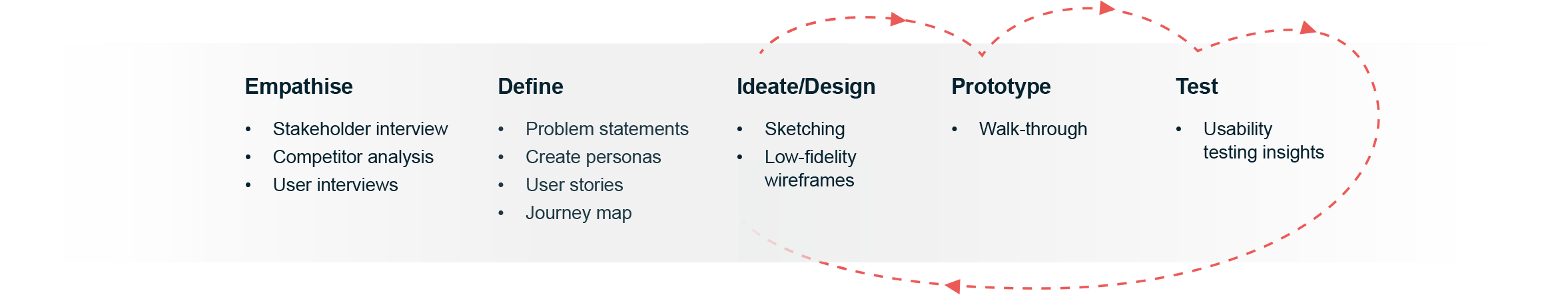
For this project I followed a five-step design thinking process, an iterative human-centred framework used to focus on user needs.
For this project I followed a five-step design thinking process.
In the research phase, this involved interviewing the stakeholder to understand the client goals and target audiences, conducting heuristic and competitor analysis, defining the goals and problems and creating user personas and scenarios.
The design phase started with sketching early concepts, developing low and high-fidelity wireframes, creating the prototype, conducting usability tests and applying the insights to iterations of the design and obtaining stakeholder feedback.
The process
Understanding what LMS users thinking and feeling
I conducted interviews with a learning designer and university educators involved in online course creation. When asked what their ideal Learning Management System (LMS) would look like, these are the topline findings:
My ideal LMS would:
include easier and more elegant content formatting (than in Moodle)
not require students to leave the platform to access external apps or sites
be mobile-friendly
allow for multiple kinds of content, especially short blocks as better for engagement
Callum
Animation Instructor and Course Designer
My ideal LMS would:
be easier (than Moodle) to design aesthetically pleasing courses which are consistent across units
have more intuitive navigation for learning designers as well as learners
include a wide variety of kinds of engaging content within the platform with no need for students to leave the LMS

Donna
Learning Designer
My ideal LMS would:
be quick and easy to make look decent (compared to Moodle)
have a drag-and-drop functionality and seamless media embedding, especially video
be more like Notion

Steve
Games Instructor and Course Designer
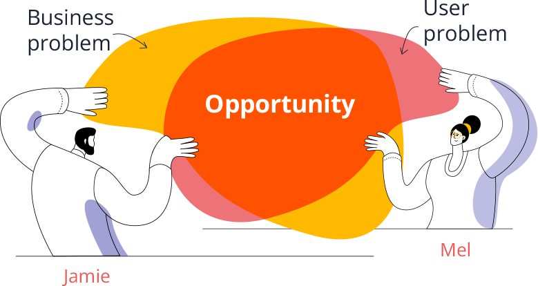
Defining the core user and business challenges
User problem
Course creation is complex, time consuming and requires experience and knowledge to create high quality, engaging courses.
Business problem
Neutopia needs an LMS platform that can empower novice learning designers to create beautiful, engaging online courses quickly and easily.
Solutions addressing key user needs
Prioritising effortless course outline creation to reduce complexity for novice designers
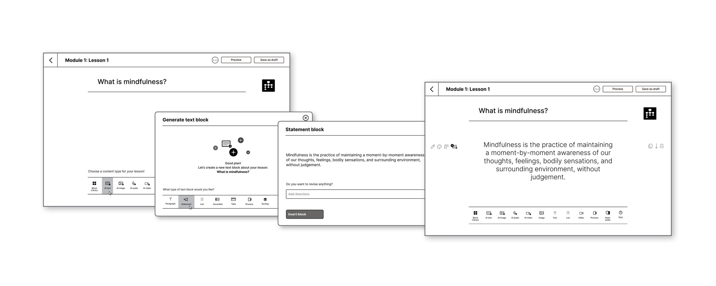
Research and journey mapping revealed that defining the course structure was one of the most overwhelming stages of the creation process. To reduce this friction, I integrated a chat-based AI into the course outline flow, supporting course creators of all experience levels through a familiar, low-effort interaction model that captures key inputs. Designers can then continuously refine the outline using chat-style prompts alongside a text editing tool.
Enabling simple content creation for learning designers of all experience levels
Lesson content is added in blocks, with the AI-generated content style informed by inputs captured during the course outline creation stage, factoring in the target audience and any accessibility considerations.
By using clear, icon-based menus users can quickly recognise actions without needing to interpret dense text, reducing cognitive load and supporting faster decision-making. The clean, uncluttered interface further reinforces this by removing distractions and guiding attention to key tasks.
Layering in AI-assisted content creation supports users at varying experience levels.
Together, these design choices enable users to move from idea to structured course content more efficiently, with greater confidence and less friction, thereby addressing the key business problem.
Usability testing
Upon creating the optimized workflow, I needed to validate the assumptions.
Solutions addressing key user needs
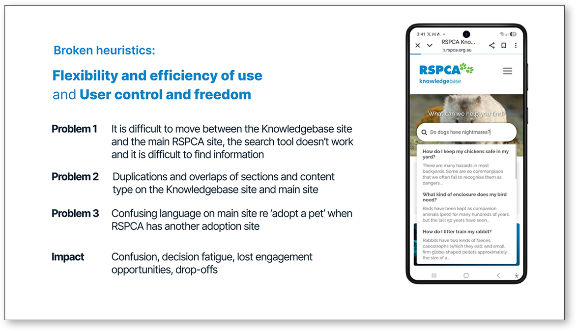
Rename and merge Knowledgebase with the main site
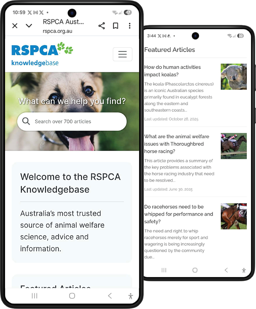
Knowledgebase is blended with main RSPCA site and renamed to “Ask and Discover”. Adoption and pet care advice is incorporated here to reduce cognitive load, streamline the journey, and improve information architecture.
Integrate an AI Answer Engine
To improve findability and engagement, I introduced an AI-assisted search tool that returns personalised, context-aware answers from the database of articles.
Revise content to meet the audience’s needs
Most users are pet owners seeking advice, so I advised a shift in content type away from academic-style articles about non-domestic animals to accessible, engaging content that provides genuine value to the target audience.
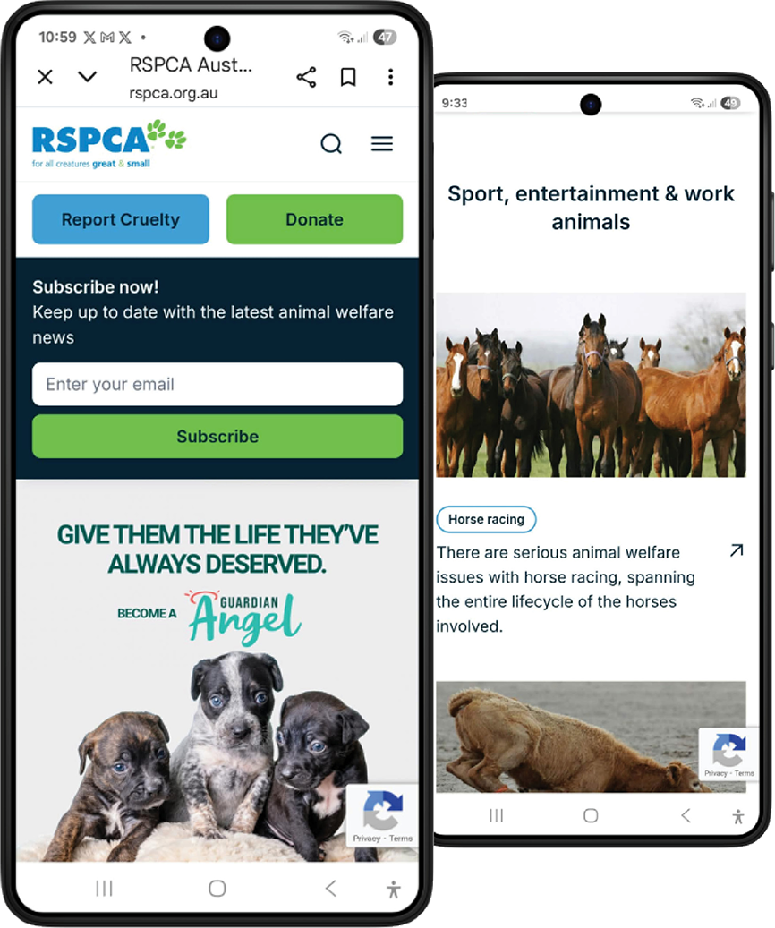
Home page
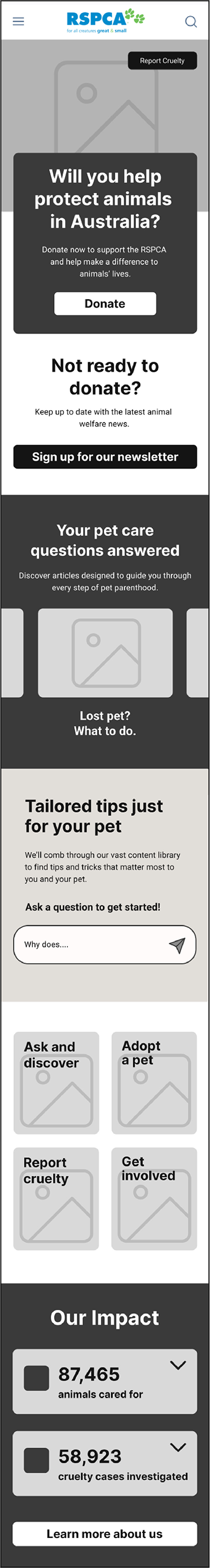
Ask and Discover section
Usability testing
Upon creating the optimized workflow, I needed to validate the assumptions. This involved low-fidelity in-person usability testing focused on findability of adoption and pet care information and navigating around the site to/from specific areas.
Design solutions informed by user insights
Following low-fidelity usability testing, I translated user insights into high-fidelity designs that reduce overwhelm, improve engagement, and guide users to key pet care and adoption content.
I also enhanced wayfinding and discoverability through layered search features, including breadcrumbs, topic tags, metadata, and AI-driven prompts and recommendations based on content and user behaviour.
Usability testing insights/next steps
Testing using the prototype showed confusion between the ‘Scout’ (AI) and generic search method in the top navigation. Also, the category search function frustrated users as it requires interpretation of icons and a growing sub-category sets, adding to cognitive load.
Next steps would respond to these insights.
Design solutions informed by user insights
Following low-fidelity usability testing, I translated user insights into high-fidelity designs that reduce overwhelm, improve engagement, and guide users to key pet care and adoption content.
I also enhanced wayfinding and discoverability through layered search features, including breadcrumbs, topic tags, metadata, and AI-driven prompts and recommendations based on content and user behaviour.
Walkthrough of flows addressing key user experience problems.
Usability testing insights/next steps
Testing using the prototype showed confusion between the ‘Scout’ (AI) and generic search method in the top navigation. Also, the category search function frustrated users as it requires interpretation of icons and a growing sub-category sets, adding to cognitive load.
Next steps would respond to these insights.
Reflection
This project highlighted the importance of engaging decision-makers early and continuously. While I worked closely with the available stakeholder and delivered a research-backed solution, the key decision-makers, who were more resistant to change, were not directly involved, which limited buy-in and implementation.
In future projects, I would prioritise identifying and involving decision-makers earlier, or creating clearer pathways (e.g. tailored artifacts, async updates) to ensure alignment beyond the immediate stakeholder and increase the likelihood of adoption.