
RSPCA Australia
Mobile-first user experience & user interface design for the RSPCA’s ‘Knowledgebase’ site — Australia's most trusted source of animal welfare science, advice, and information.
Project overview
About RSPCA Australia and RSPCA Knowledgebase
RSPCA Australia is the national body for the RSPCA federation – an independent, community-based charity providing animal care and protection services across the country.
RSPCA Knowledgebase is an online resource for evidence-based animal welfare science. It is a separate site to RSPCA Australia’s main site.
Project description
I was tasked with redesigning the RSPCA Knowledgebase for mobile to support its strategic goal of reinforcing its position as Australia’s leading authority on animal welfare.
The project focused on improving the findability of trusted pet care and adoption content, increasing engagement and dwell time, and streamlining pathways between the Knowledgebase and the main RSPCA Australia site. By reducing friction and better connecting information to action, the redesign aims to build user trust and support growth in donations, newsletter subscriptions, and the broader supporter base.
Project outcomes and results
I translated complex research into actionable insights and a cohesive redesign direction, helping stakeholders better understand user pain points and opportunities. I made abstract UX recommendations concrete, enabling more informed internal discussions around future improvements.
The project was well received by the client.
MY ROLE
UX/UI Designer
DONE WITH
Harness Projects in partnership with RSPCA Australia
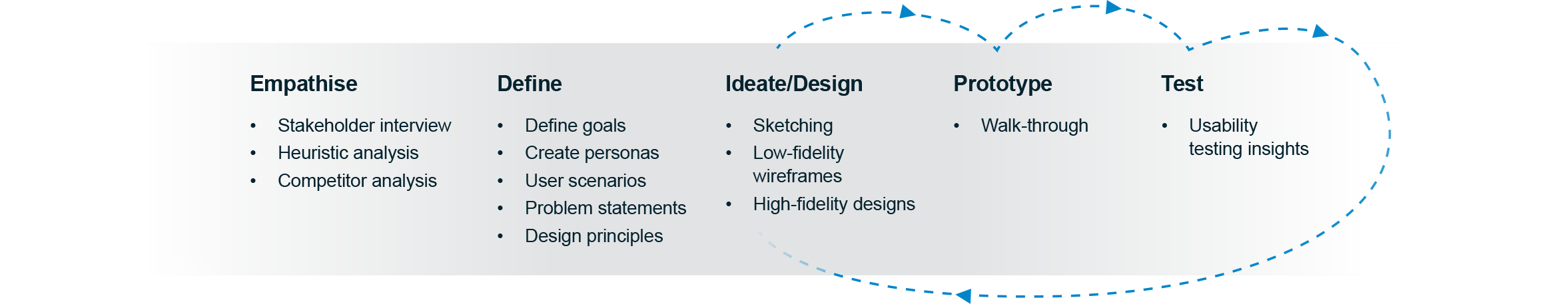
For this project I followed a five-step design thinking process, an iterative human-centred framework used to focus on user needs.
For this project I followed a five-step design thinking process.
In the research phase, this involved interviewing the stakeholder to understand the client goals and target audiences, conducting heuristic and competitor analysis, defining the goals and problems and creating user personas and scenarios.
The design phase started with sketching early concepts, developing low and high-fidelity wireframes, creating the prototype, conducting usability tests and applying the insights to iterations of the design and obtaining stakeholder feedback.
The process
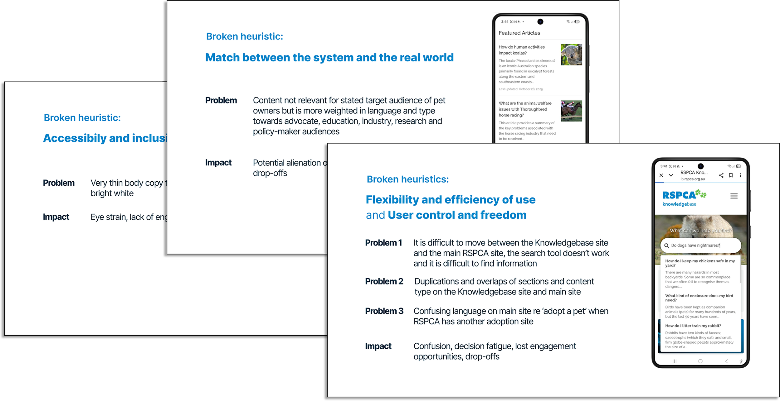
Heuristic analysis
Analysis of the Knowledgebase site uncovered multiple broken heuristics impacting the user experience and offering opportunities for improvement.
Defining the problem
Problem 1: Having two separate sites causes confusion, friction and reduces opportunities for discoverability and engagement.
Problem 2: Difficult to find specific user-centred information relating to pet care and adoption information.
Problem 3: Shallow engagement and a falling rate of return visits. 10 second bounce rate.
The ‘as is’ state
The ‘as is’ state
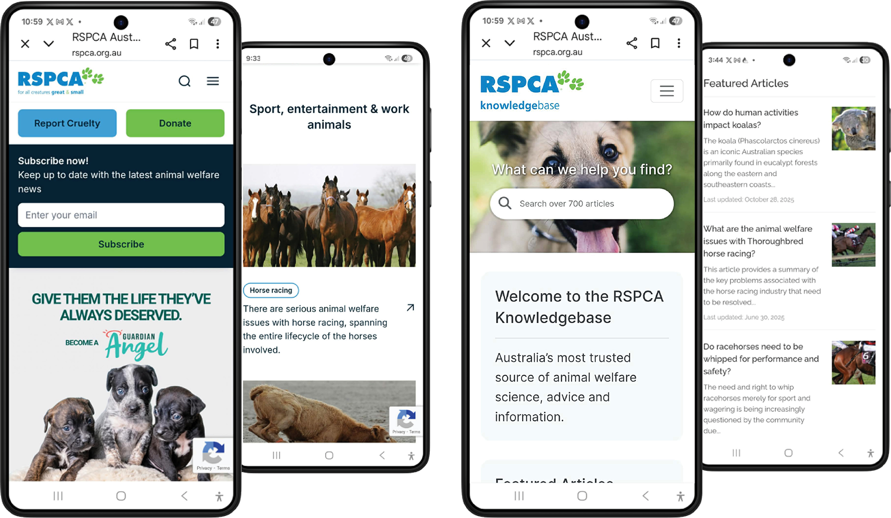
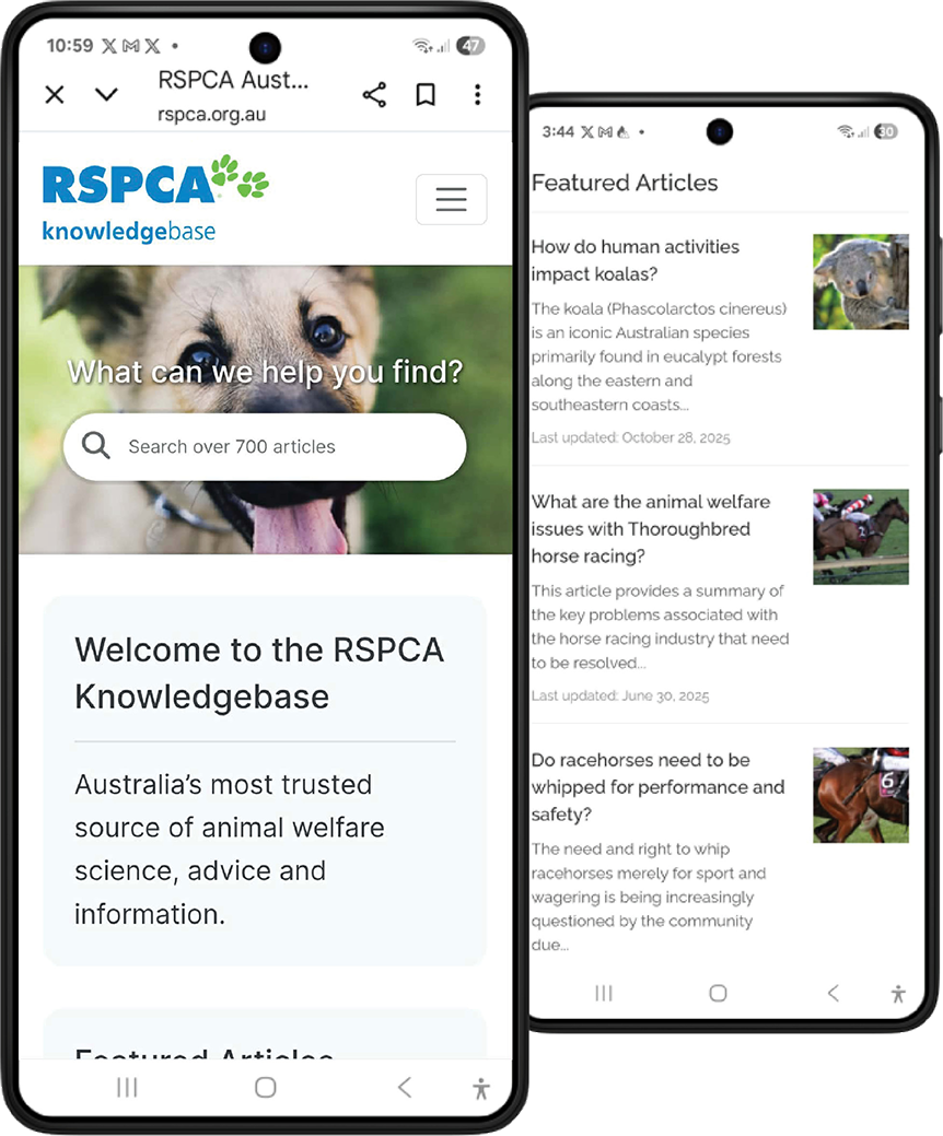
Main site
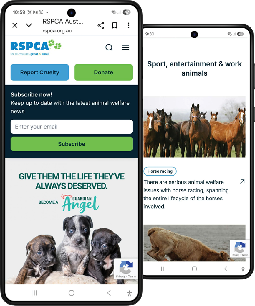
Knowledgebase site
Solutions addressing key user needs:
Rename and merge Knowledgebase with the main site
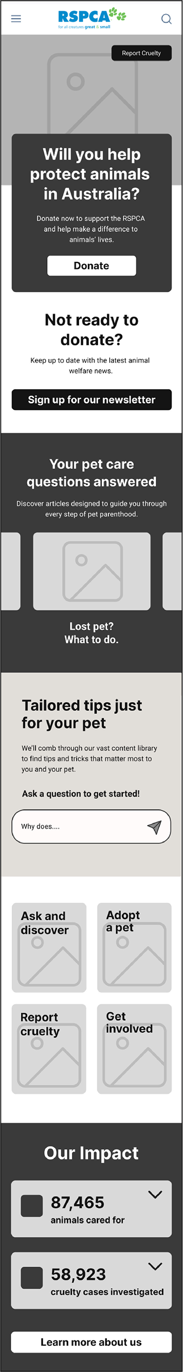
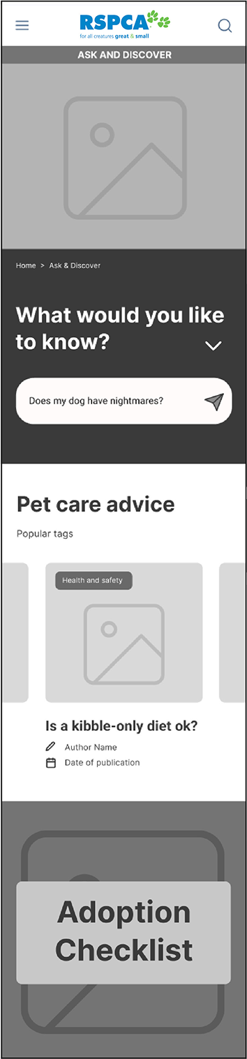
Knowledgebase is blended with main RSPCA site and renamed to “Ask and Discover”. Adoption and pet care advice is incorporated here to reduce cognitive load, streamline the journey, and improve information architecture.
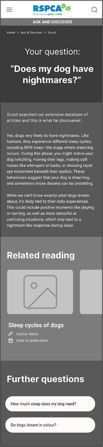
Integrate an AI Answer Engine
To improve findability and engagement, I introduced an AI-assisted search tool that returns personalised, context-aware answers from the database of articles.
Revise content to meet the audience’s needs
Most users are pet owners seeking advice, so I advised a shift in content type away from academic-style articles about non-domestic animals to accessible, engaging content that provides genuine value to the target audience.
Usability testing
Upon creating the optimized workflow, I needed to validate the assumptions. This involved low-fidelity in-person usability testing focused on findability of adoption and pet care information and navigating around the site to/from specific areas.
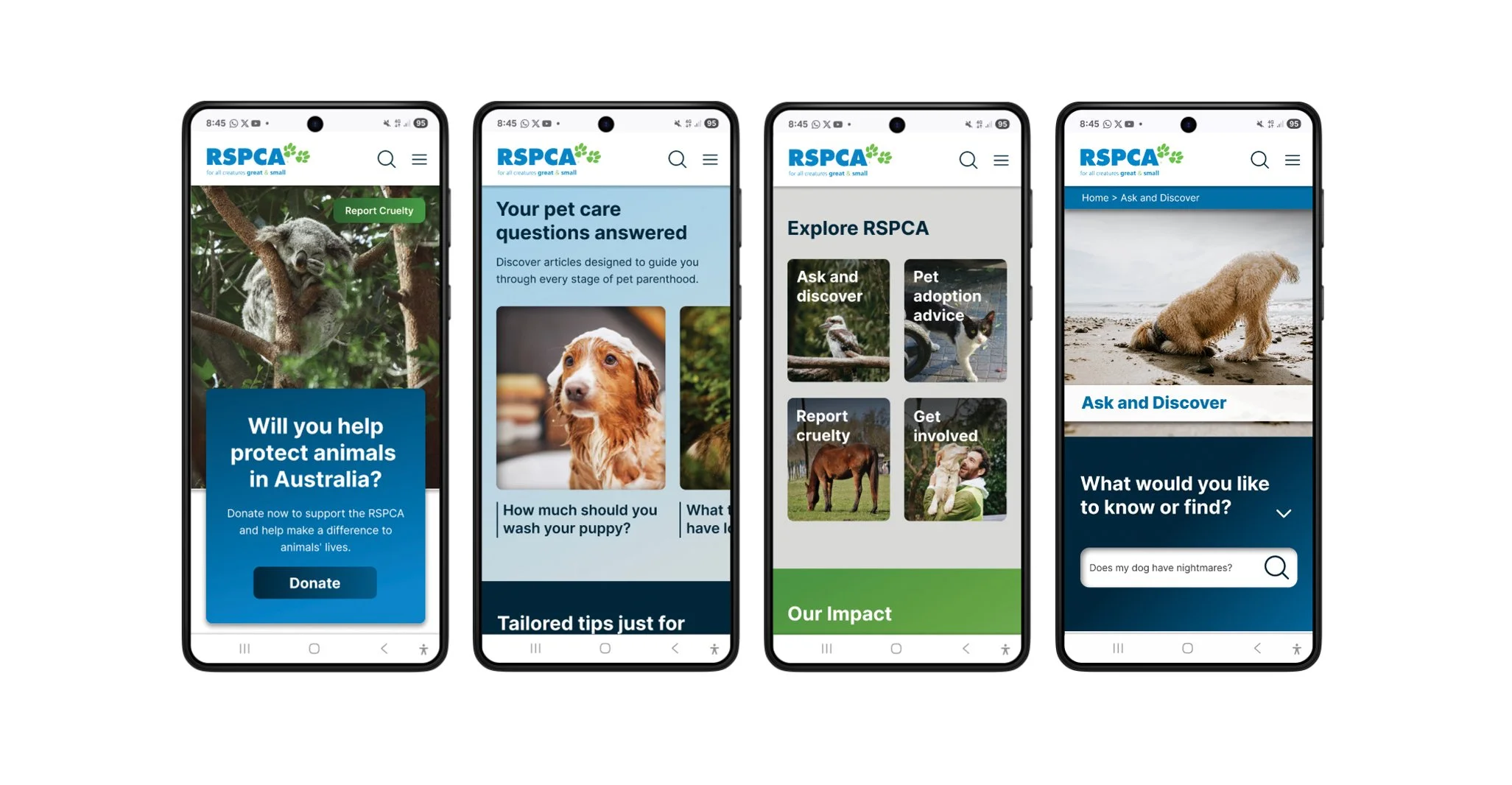
Solutions addressing key user needs
Rename and merge Knowledgebase with the main site
Knowledgebase is blended with main RSPCA site and renamed to “Ask and Discover”. Adoption and pet care advice is incorporated here to reduce cognitive load, streamline the journey, and improve information architecture.
Integrate an AI Answer Engine
To improve findability and engagement, I introduced an AI-assisted search tool that returns personalised, context-aware answers from the database of articles.
Revise content to meet the audience’s needs
Most users are pet owners seeking advice, so I advised a shift in content type away from academic-style articles about non-domestic animals to accessible, engaging content that provides genuine value to the target audience.
Home page
Ask and Discover section
Usability testing
Upon creating the optimized workflow, I needed to validate the assumptions. This involved low-fidelity in-person usability testing focused on findability of adoption and pet care information and navigating around the site to/from specific areas.
Design solutions informed by user insights
Following low-fidelity usability testing, I translated user insights into high-fidelity designs that reduce overwhelm, improve engagement, and guide users to key pet care and adoption content.
I also enhanced wayfinding and discoverability through layered search features, including breadcrumbs, topic tags, metadata, and AI-driven prompts and recommendations based on content and user behaviour.
Usability testing insights/next steps
Testing using the prototype showed confusion between the ‘Scout’ (AI) and generic search method in the top navigation. Also, the category search function frustrated users as it requires interpretation of icons and a growing sub-category sets, adding to cognitive load.
Next steps would respond to these insights.
Design solutions informed by user insights
Following low-fidelity usability testing, I translated user insights into high-fidelity designs that reduce overwhelm, improve engagement, and guide users to key pet care and adoption content.
I also enhanced wayfinding and discoverability through layered search features, including breadcrumbs, topic tags, metadata, and AI-driven prompts and recommendations based on content and user behaviour.
Walkthrough of flows addressing key user experience problems.
Usability testing insights/next steps
Testing using the prototype showed confusion between the ‘Scout’ (AI) and generic search method in the top navigation. Also, the category search function frustrated users as it requires interpretation of icons and a growing sub-category sets, adding to cognitive load.
Next steps would respond to these insights.
Reflection
This project highlighted the importance of engaging decision-makers early and continuously. While I worked closely with the available stakeholder and delivered a research-backed solution, the key decision-makers, who were more resistant to change, were not directly involved, which limited buy-in and implementation.
In future projects, I would prioritise identifying and involving decision-makers earlier, or creating clearer pathways (e.g. tailored artifacts, async updates) to ensure alignment beyond the immediate stakeholder and increase the likelihood of adoption.